The 2023-24 City Edition uniforms have officially been released around the NBA. It’s a time for organizations to get creative and highlight famous or historic parts of the cities they represent.
I enjoy the discussion of jerseys — because there is no right or wrong. You’re allowed to like whichever ones you want. And Philly, across the board, has been gifted some of the best jerseys in the sports world.
Stay in the game with the latest updates on your beloved Philadelphia sports teams! Sign up here for our All Access Daily newsletter.
I also think it’s important to preface the rankings with this … I don’t think the Sixers have had a *bad* City Edition jersey. There have been some doozies around the league over the years, but not in Philly.
We’ve certainly lucked out on that front. Prepare to see the good, the great and just absolute perfection.
Anyways — on to the rankings:
7. Boathouse Row (2020-21)
Philadelphia 76ers


Believe it or not, the Boathouse Row jerseys are not listed last because Ben Simmons helped create them (I actually found the story behind him being a part of the design process very cool). It has just been preached by fans for *years* that if the Sixers were to ever do a black jersey again, it should pay homage to the Allen Iverson era.
It was hyped up so much … and then we got … this.

The concept is pretty unique — and anyone in the tri-state area would immediately recognize the silhouettes of the illuminated boathouses. The layout on the front of the jerseys has always been just a bit awkward for my liking, though.
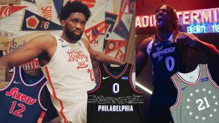
6. Reading Terminal (2023-24)
This year’s City Edition uniforms — across the league — were pretty meh compared to previous years. The Sixers went the route of taking inspiration from the iconic Reading Terminal Market, and while it may not seem too fun and flashy, the meaning behind it is nice.
“We were drawn to Reading Terminal Market’s rich history and tradition that has been built over the past 130 years, making it a staple in our city and an easy choice for the inspiration behind this year’s City Edition,” said Katie O’Reilly, 76ers Chief Revenue Officer. “It is thrilling to see the City of Brotherly Love wordmark come to life with the Market’s iconic neon signage, and we hope these uniforms help shine a light on the diverse, rich and historic culture within its walls.
It makes sense to keep the “City of Brotherly Love” on uniforms that are meant to, well, represent the city. It’s the second consecutive season the wordmark has made an appearance. To stick with this year’s theme though, they pulled inspiration from the neon signage that has adorned the outside of the Market since the 1940s.
They’re fun and a great nod to the 80-plus family-owned small businesses that call the Reading Terminal Market home.

5. Liberty Bell (2019-20)
The cream colorblock with the team’s classic red, white and blue is such a great combination.
The uniform as a whole is definitely dubbed better than the jersey by itself. The stripe down the shorts as a reference to the crack in the Liberty Bell is easily one of the best features across any of these designs.
But, at the end of the day, these just don’t compare to the other cream City Editions (that you’ll read more about in 30ish seconds).

4. City of Brotherly Love (2022-23)
Inspired by the “rich history of basketball in the city,” this was the first time in team history that the “City of Brotherly Love” wordmark made its way to a jersey. Honestly, it was overdue.
The fonts chosen were such a big question mark, though. To me, it felt like when you were younger and played with the most random fonts when you gained access to Microsoft Word for the first time. The letter and number fonts don’t seem cohesive — and one has a border while the other doesn’t. It just feels like a bit of a disconnect.

And yet, I still like them. Sue me.
3. Declaration of Independence (2017-18)
If you told me prior to the 2017-18 season that someone was going to design a jersey that was inspired by the Declaration of Independence, my response would have been … uh, okay?
Yes, I know it was signed in 1776 and the year is the origin of the team's name and it all makes perfect sense. Still. I hear Declaration of Independence and I think Nicholas Cage is going to appear out of thin air to try and steal it. I don't think of a basketball jersey.
Good thing I don't get a say in designs — because the Sixers came out of the gate swinging — and I love them.
These jerseys are cleeean. It was the first City Edition design for the Sixers and they really nailed the concept from top to bottom.
The style of lettering and choice of color made these an instant classic.

2. Rocky/Creed (2018-19)
The Rocky/Creed-inspired City Edition lands second overall on this list because of the jersey *and* the brilliant marketing that went into them. If you’re from Philly, the Rocky films are sacred (except the fifth one ... we don't walk about that one). If you’re *not* from Philly, these films are a perfect way to understand the mentality of sports in the city.
They gave us the gray sweatshirt base that was influenced from the training scenes in the streets of Philadelphia. The 13 stars represent the ring where Balboa first squared off against Apollo Creed in 1976. It was just the perfect blend between the team and the concept.
Some may say the gray was too plain and boring, but when someone mentions City Editions — this is always the first one that come to mind. That says something.
Executed to perfection. 10/10. No notes.

1.Spectrum Era (2021-22)
These, simply put, are a work of art.
In a single jersey, the Sixers were able to pay homage to the iconic arena and history of their organization. You saw the 1970s-style team wordmark across the chest, Spectrum logo colors that represent every team in the city on the sides and it was paired with a navy-blue base color that, well, was just very appealing to the eyes. Sometimes it’s that simple.
“The Spectrum holds a very special place in our franchise lore, having served as the 76ers’ home arena for nearly three decades,” said former Sixers President of Business Operations Chris Heck during the initial press release. “The memories made at America’s Showplace, including the historic 1982-83 championship season, are priceless, and will be relived through the 2021-22 Nike NBA City Edition uniform. We’re also excited to display the colors of the Spectrum logo, which represent the teams that our fans love and support here in Philadelphia.”
If the Sixers came out tomorrow and said they would be named a permanent alternate for the foreseeable future, I don’t think anyone would be mad about it.
Not at all.

They are just perfection.